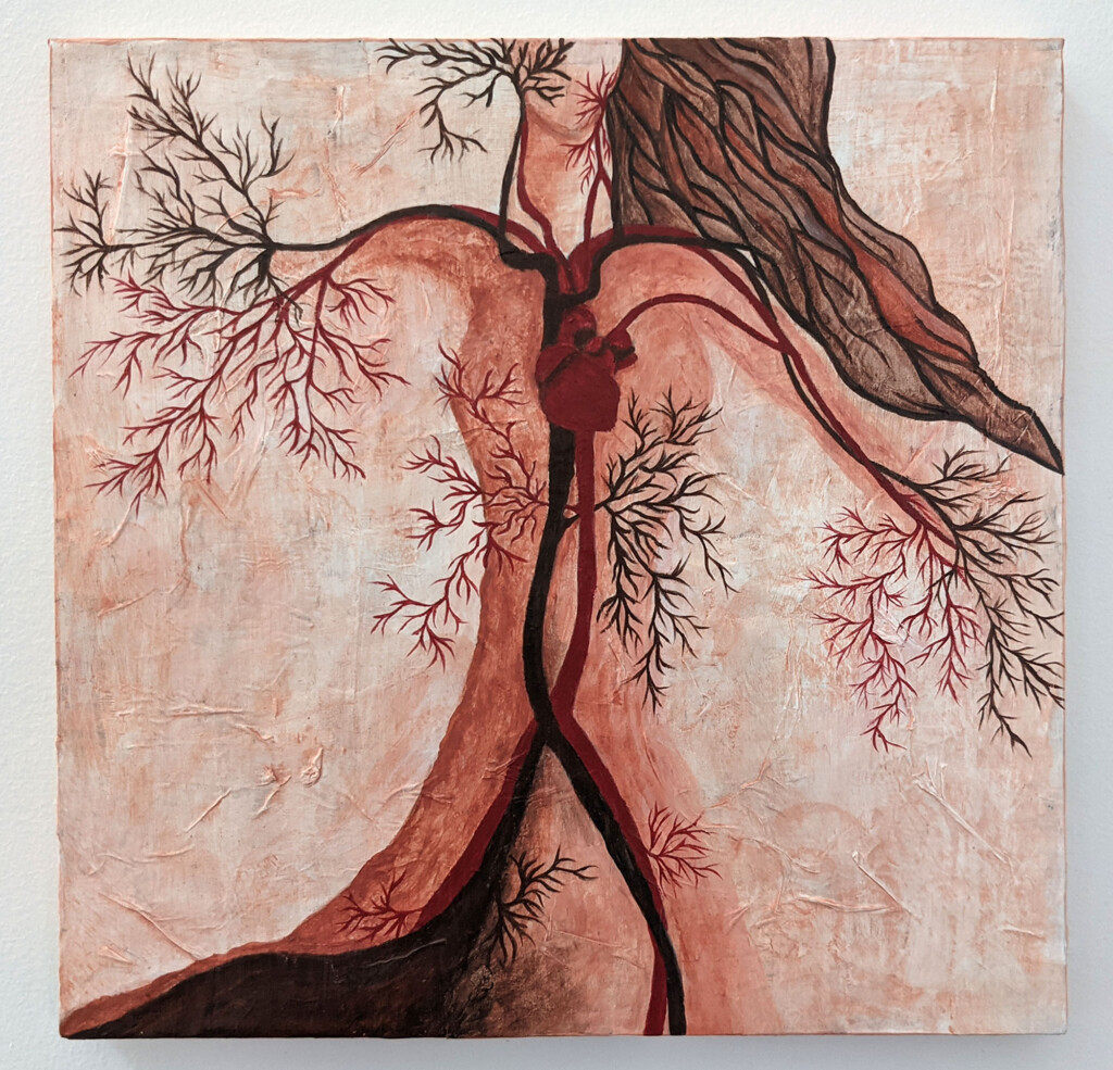
I saw an Instagram post from Garrison Art Center, a little art gallery near me, calling for entries for their “ART is every where” fundraiser. They provided each artist with a 10×10 wood panel to contribute. You then had to choose a word that had ‘art’ in it, like martini, and create something based on that word. They plan to auction the pieces off to raise money for the gallery.
Although I have never submitted anything to a fundraiser or a gallery, I was excited to give it a shot!
I would never have thought that I could do it if I hadn’t been making art all year for the first time in my life. In January of this year, I signed up for a mixed media journaling course called Wanderlust. Each week is a different “assignment” with new techniques and materials.
The word I chose was ‘arteriography’. I’m sure it would have been easier to use the word martini but because once I saw the word, I couldn’t get it out of my head! Arteriography is “radiography of an artery, carried out after injection of a radio-opaque substance“. This procedure allows you to see any issues within the artery.
I had 3 different ideas but went with this one. Veins and tree branches (and other organic elements) all share this branching system, a fractal pattern that is present in the bare branches of trees, the meandering paths of rivers and streams and even our own veins and arteries snaking through our bodies. I wanted to show how life and it’s patterns are connected between mother earth and us.
I did put it off a bit so I JUST finished it the morning it was due but I did it! I was making myself anxious by overthinking but I just kept telling myself, this is just another art journal. I used the same base layers I use for a lot of my work (newspaper, tissue paper and gesso).
[su_custom_gallery source=”media: 17064,17065,17066,17067,17068,17069,17070″ link=”lightbox” width=”250″ height=”250″ title=”none”]
I used a technique I learned in the Wanderlust course call the ‘mother color’ technique. Mother color is any color that is not on the current palette that you’re using but you mix a little of that color into every color you are using and it unifies and creates a mood in the painting.
I used Red Ochre as my mother color and I think the colors really came out well. It helped simplify and focus the palette.

