• About
  • Buy Prints
  • Etsy
  • Blog
  • Contact
  • Home

Good Fortune Studios

Beauty. Attention. Creation.

You are here: Home / Art / A Certain Shade of Lipstick

A Certain Shade of Lipstick

August 5, 2011 by Rayna Diane Hennen


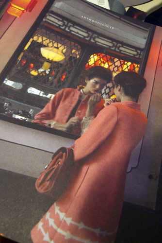
I was so excited when I received the most recent Anthropologie catalog. The cover was perfect for a poem I had been saving from a magazine that I didn’t want to get rid of but didn’t know what to do with, either.

Ink Outlines

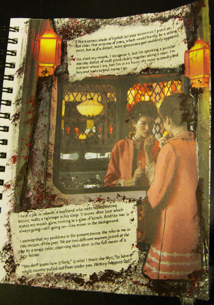
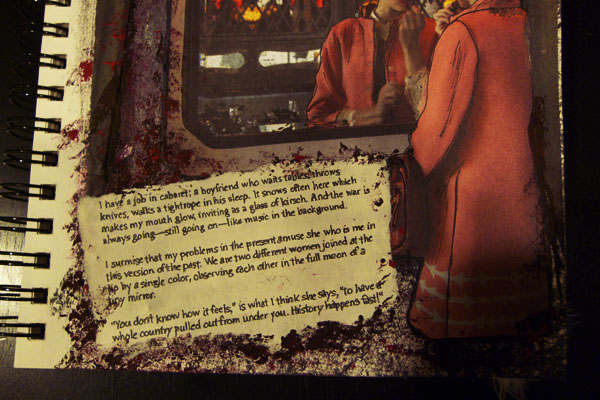
The poem starts out “I like a certain shade of lipstick…” and goes on with references to war, cabaret and far away places covered in snow. I felt that the lighting in this catalog cover image conveyed that feeling of another time and place. And of course she is putting on that certain shade of lipstick!

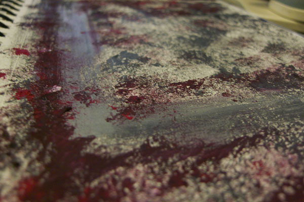
I started out with a sponged layer of gray paint and then mixed red and black to deepen the tone. I really like the pops of red because it pulls in that distant war that is going on the background. When I first glued the image of the woman down, she didn’t stand out against the strong paint so using a black outline technique I read about recently, I outlined her and the mirror and even added some lines to the image itself to give it some movement.

Close up of lantern

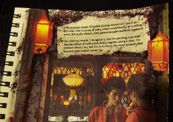
For the text, the paper was so new looking and even with the edges torn, it still stood out too much. I took a Prismacolor Marker in 10% Cool Grey and colored over the paper and then, with a Pigment Pen wrote over the typed letters to soften the it and make it feel like the woman in the image had written it herself. I ran the marker over the text again once I was done writing. Once the glue was on the paper, it thinned it out even more allowing some of the bumps from the paint underneath to texture the paper and with a few more dabs of paint, the paper blended in really well. I then used some of the thick, leftover paint to really add some depth under the lanterns.

Poem is ‘Instant Past’ by Elaine Equi, featured in the 2008 issue of Pool poetry magazine.

Photo Gallery
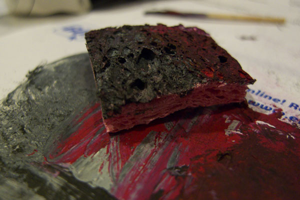
  • Sponge
  • Paint Underlayer
  • Anthropologie Catalog
  • Full Page
  • Top of Page
  • Bottom of Page

About Rayna Diane Hennen

Summer Wreath
Just Opening

Creativity & Cringe

Hello Lovely Creative Human! Sign up for my once a month newsletter that could include recent blog posts, photos listed for sale and other musings about art, books, photography, nature and life.

  • Contact
  • Privacy Policy
  • Terms and Conditions
  • Disclaimer

goodfortunestudios

Experiments in creativity and cringe. Join me!

Welcome to October! Welcome to October!
Sometimes the loveliest photos are found by lookin Sometimes the loveliest photos are found by looking down at your feet! A birch root surrounded by moss/lichen.

#birchroot #birch #mosssporophytes
I love contrast, like flowers against something ma I love contrast, like flowers against something manmade. This image of a fence post with golden yellow flowers  was taken in Ennis, Montana along a dirt road. 

#flowerphotography #chamisa #rubberrabbitbrush
Lunch is served! 😄 I like how it turned out. Look Lunch is served! 😄  I like how it turned out. Looks pretty much how I thought it would, which is a moment to celebrate because so many times, especially when you're learning , things don't always turn out the way you want them to.

Also, I apparently associate summer with picnics and ants, even though I honestly don't picnic very much. In the second photo, is a very early art journal picnic spread. The blanket is made with the squares from a knitting magazine and other magazine clippings.

#mixedmedia #artjournaling
Newsletter creativity and cringe Our strengths ca Newsletter creativity and cringe

Our strengths can also be our weaknesses. One of those things about me that is both annoying and awesome is I'm pretty honest about stuff. Like whatever I'm going through or sitting and listening to what someone else is going through, I mean, I've had some heavy conversations over a beer with strangers in a bar. 🤷‍♀️ When you're not up for that I'm sure it's like oh God here comes rayna hide!!

So here's the thing. This – this art sharing stuff – is really hard for me. Scientifically speaking, your brain can't actually tell the difference between a lion and a paint brush (cool cool.) so I thought I'd just break the ice and own how cringey I feel about it 🤣  and also my brain: 🦁 😱

And then a number of you are friends which is actually harder to share with than strangers – truth! and not uncommon for people to feel that way – but also – 'preciate ya! as they say in football.

On that note, please join me further on my journey of creativity and cringe (and my love of alliteration) by signing up for my monthly newsletter. And hopefully, later on, we can look back together and be like, wow, yeah, you've come a long way! I can't believe you shared that early stuff... 😬🤞

Sometimes they’ll be a little “heavier”, some will be a little lighter. Look – I have no idea where this is going so be sure to bring snax. 🍿 🍫

Link in the bye-oh as one of my fave authors likes to say. K bye! 👋

#creativityandcringe
on occasion, i go completely out of my usual type on occasion, i go completely out of my usual type of art and create these graphic pages. i do remember doodling stuff like this on the inside of my binders in jhs and hs.
The transition to fall can be a bit of a let down The transition to fall can be a bit of a let down after a summer full of blooms but I truly love little bits of decay as things start to break down. 

#fallfloral #atouchofdecay #floraldecay #falltakeshold
There is a beautiful campground in VT - Silverlake There is a beautiful campground in VT - Silverlake State Campground. The campsites are all tucked into the actual shape of the land instead of rows of campsites next to each other.

If you get up early-ish, the fog sits on the lake (second image) and creates some dreamy but sort of eerie images. 

#purpleaster #aster #floralphotography
Follow on Instagram

© 2026 · Good Fortune Studios